How to Create a UI Color Palette: Trends & Best Practices for 2024
In the world of design, colors play a crucial role in shaping user experience. They evoke emotions, convey messages, and guide users through digital interfaces. Creating a well-crafted UI color palette is essential for establishing brand identity, enhancing usability, and staying relevant in the ever-evolving landscape of design trends. As we step into 2024, let's explore the latest UI design trends and best practices for creating compelling UI color palettes.
Understanding Color Psychology
Before diving into the specifics of color palette creation, it's essential to understand the psychology behind colors. Different hues evoke various emotions and perceptions, which can significantly impact how users interact with a product.
Here's an overview:
- Red: Associated with passion, excitement, and urgency. It can also signify danger or warnings.
- Blue: Evokes feelings of trust, calmness, and professionalism. It's commonly used in corporate settings.
- Yellow: Represents optimism, happiness, and energy. It can also grab attention but should be used sparingly due to its potential to strain the eyes.
- Green: Symbolizes nature, growth, and freshness. It's often used in environmental or health-related contexts.
- Purple: Conveys luxury, creativity, and royalty. It's frequently used in beauty or artistic industries.
- Orange: Represents enthusiasm, warmth, and vitality. It can stimulate appetite and is often used in food-related applications.
These are just a few examples, and each color carries its own nuances and cultural connotations. Understanding these associations is crucial when designing a color palette that resonates with your target audience.
Want to dive deep? Read Color Psychology: Understand it to Make Brand
Trends for 2024
1. Neomorphism
Neomorphism, or soft UI, is gaining traction in 2024. It involves creating interfaces with subtle, soft shadows and highlights, mimicking the appearance of physical objects. Neomorphic color palettes often feature muted tones, such as pastel blues, grays, and greens, creating a modern and minimalist aesthetic.
2. Dark Mode
Dark mode continues to be popular, offering users a sleek and immersive experience while reducing eye strain, particularly in low-light environments. Dark mode color palettes typically feature deep, dark hues contrasted with vibrant accent colors to maintain readability and visual interest.
3. Gradients and Duotones
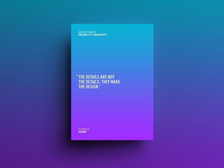
Gradients and duotones add depth and visual interest to UI design. In 2024, designers are experimenting with bold gradient combinations, as well as subtle duotone effects to create dynamic and vibrant interfaces. These techniques allow for creative expression while maintaining accessibility and usability.
4. Sustainability-Inspired Palettes
With growing environmental consciousness, sustainability-inspired color palettes are gaining popularity. Earthy tones such as greens, browns, and blues evoke a sense of nature and sustainability, aligning with brands' eco-friendly initiatives and values.
5. High Contrast and Vibrancy
To capture users' attention and create memorable experiences, many designers are opting for high-contrast color palettes with vibrant hues. Bold combinations of complementary colors, such as yellow and purple or blue and orange, create visual impact and convey energy and excitement.
Best Practices for Creating UI Color Palettes
While trends provide inspiration, creating a cohesive and effective UI color palette requires careful consideration and planning.
Here are some best practices to keep in mind:
1. Understand Brand Identity
Your color palette should reflect your brand's identity, values, and personality. Consider your brand's aesthetic, target audience, and industry when selecting colors. Consistency across all touchpoints reinforces brand recognition and fosters trust with users.
2. Consider Accessibility
Accessibility should be a top priority when designing color palettes. Ensure sufficient contrast between text and background colors to accommodate users with visual impairments. Tools like the Web Content Accessibility Guidelines (WCAG) can help ensure your color choices meet accessibility standards.
3. Limit the Number of Colors
While it's tempting to incorporate a wide range of colors, a cluttered color palette can confuse users and detract from the overall user experience. Limit your palette to a few primary colors supplemented by a selection of complementary accent colors. This creates visual cohesion while allowing for flexibility and variety.
4. Test Across Devices and Environments
Colors may appear differently on various devices and in different lighting conditions. Test your color palette across multiple devices and screen resolutions to ensure consistency and readability. Consider how colors will appear in both light and dark modes, as well as in outdoor settings or under artificial lighting.
5. Iterate and Refine
Creating the perfect color palette is an iterative process. Gather feedback from users, stakeholders, and fellow designers, and be willing to make adjustments based on their input. Continuously refine your color palette to ensure it remains relevant and effective in meeting user needs and design goals.
Conclusion
Creating a compelling color palettes in UI design is a blend of art and science, requiring an understanding of color psychology, design trends, and best practices. By embracing current trends, understanding your brand identity, and prioritizing accessibility and usability, you can craft color palettes that enhance user experience, strengthen brand identity, and set your designs apart in 2024 and beyond. Remember, the key is to strike a balance between creativity and functionality, creating visually stunning interfaces that are also intuitive and user-friendly.


Comments
Post a Comment